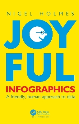
Joyful Infographics
Taylor & Francis Ltd (Verlag)
978-1-032-11965-6 (ISBN)
In Joyful Infographics: A Friendly, Human Approach to Data, one of the leading graphic designers of recent times shows how a judicious use of humor can make infographics more understandable. Written in non-academic, easy-to-understand language, and with historical and contemporary visual examples presented throughout, this small book provides a short history of light-hearted graphics. The text outlines nine clear ways to make graphics more understandable, explores the importance of the audience, shows you how to make information come alive during presentations through live-action ‘performance’ graphics, discusses why joy and smiling are good for you, and shows you how not to overdo it. The author website, featuring enlargeable graphics, can be found here: https://www.joyfulinfographics.com/.
Even if a subject is delicate, controversial, or taboo, being graphically friendly to the audience is the right way to explain it. It is the opposite of being clinically cold and just presenting the facts. If you can get readers to smile--the smile of recognition when they understand the graphic--you are more than halfway toward getting them to continue reading, and understanding, the intention of the piece. Joyful Infographics teaches you how to do just that.
Nigel Holmes has written ten books (now eleven!) on information design and infographics. He is the former graphics director at Time magazine, has lectured globally, and has taught at Stanford and Yale. His diverse list of clients includes the BBC, Ford, Heinz, BMW, Sony, Estée Lauder, and Apple, and his work has appeared in a wide range of media including the New York Times, Rolling Stone, Esquire, Sports Illustrated, New Scientist, National Geographic, Scientific American, and the New Yorker. He has given three TED talks, his work has been exhibited internationally, and he is the recipient of multiple awards, including the Lifetime Achievement Award from The Society of News Design, and the Ladislav Sutner Award.
0. Warming up : It's good to exercise. 1. Introduction: in which I try to define Joyful and Infographics. 2. Influences : Great Uncle George, Monty Python, Eadweard Muybridge, Thelonious Monk (among others). 3. Pictorail data through the ages. 4. Nine ways to make your graphics joyful : A timeline. 5. Icons. 6. Joyful presentations: Speak up. 7. Science : Serious fun for all. 8. Chartoons and jokes : Including a chart about diamonds. 9. Don't do this! : Really awful things I've done that you really shouldn't.
| Erscheinungsdatum | 01.12.2022 |
|---|---|
| Reihe/Serie | AK Peters Visualization Series |
| Zusatzinfo | 206 Line drawings, color; 53 Halftones, color; 259 Illustrations, color |
| Verlagsort | London |
| Sprache | englisch |
| Maße | 174 x 246 mm |
| Gewicht | 560 g |
| Themenwelt | Kunst / Musik / Theater |
| Mathematik / Informatik ► Informatik ► Theorie / Studium | |
| Mathematik / Informatik ► Mathematik | |
| Sozialwissenschaften ► Kommunikation / Medien ► Kommunikationswissenschaft | |
| ISBN-10 | 1-032-11965-9 / 1032119659 |
| ISBN-13 | 978-1-032-11965-6 / 9781032119656 |
| Zustand | Neuware |
| Informationen gemäß Produktsicherheitsverordnung (GPSR) | |
| Haben Sie eine Frage zum Produkt? |
aus dem Bereich


