iPhone Design Award-Winning Projects (eBook)
216 Seiten
Apress (Verlag)
978-1-4302-7234-2 (ISBN)
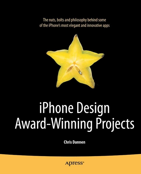
This book profiles developers who have received the prestigious Apple Design Award for iPhone app excellence. You'll learn all about what makes these apps truly standout, including explanations of great user interface design and implementation, as well as the code under the hood that makes these the most responsive, intuitive, useful, and just plain fun apps running on the iPhone.
- Insightful profiles of the developers behind Tweetie, Topple 2, AccuTerra, Postage, and Wooden Labyrinth 3D
- Detailed explanations of the technical wizardry that makes these apps tick
- Full-color screenshots and copious downloadable code snippets to get you started building the next iPhone Design Award-winning apps
Chris Dannen is a technology journalist for FastCompany magazine and CBS Interactive. He has authored one Apress book, iPhone Design Award-Winning Projects: The Definitive Guide, published in early 2010, and wrote Google Voice for Dummies (2009). He has also written for Inc., Rolling Stone, and Discover magazines. He has worked extensively with foursquare and Facebook in the past, including for his last Apress book, and also has good relationships with developers at Twitter. He holds a degree in English literature from the University of Virginia. He is based in Brooklyn, New York.
This book profiles developers who have received the prestigious Apple Design Award for iPhone app excellence. You'll learn all about what makes these apps truly standout, including explanations of great user interface design and implementation, as well as the code under the hood that makes these the most responsive, intuitive, useful, and just plain fun apps running on the iPhone. Insightful profiles of the developers behind Tweetie, Topple 2, AccuTerra, Postage, and Wooden Labyrinth 3D Detailed explanations of the technical wizardry that makes these apps tick Full-color screenshots and copious downloadable code snippets to get you started building the next iPhone Design Award winning apps
Chris Dannen is a technology journalist for FastCompany magazine and CBS Interactive. He has authored one Apress book, iPhone Design Award-Winning Projects: The Definitive Guide, published in early 2010, and wrote Google Voice for Dummies (2009). He has also written for Inc., Rolling Stone, and Discover magazines. He has worked extensively with foursquare and Facebook in the past, including for his last Apress book, and also has good relationships with developers at Twitter. He holds a degree in English literature from the University of Virginia. He is based in Brooklyn, New York.
Title Page
1
Copyright Page
2
Contents at a Glance 3
Table of c
4
About the Authors 6
About the Technical Reviewer 7
Acknowledgments 8
Introduction 9
Readme 9
Who is this book for? 9
How technical is it? 9
How were these interviewees chosen? 9
Part I Innovating Beyond Apple’s Design Standards, While Maintaining Apple’s Logic for Consistency, Clarity, and Usability
11
Chapter 1 Tweetie
12
A Billion Bad Twitter Apps 13
The Minimalist Flourish 16
Tearing Down Tweetie 21
Organic Marketing 22
Tweetie 2 26
Market Share 29
Chapter 2 Facebook
31
How did you become the sole iPhone developer at Facebook? 32
Yet Facebook Touch looks much different than the iPhone app. 33
Why isn’t a static nav bar at the bottom of the screen useful for Facebook? 33
What was the thinking behind the grid interface? 33
You also use the top nav in an interesting way in this new version. Is the redesign a consequence of implementing the grid?
33
What are the compromises involved in using the grid? 34
What went into creating Facebook’s view controllers? 34
Is it tempting to start playing with MapKit and add friend-mapping? 35
Is there a point where the Facebook app gets too big? 35
When the app gets memory warnings from the OS, how does it deal with them? 35
Otherwise, it all stays cached? 36
Why couldn’t Facebook for iPhone have kept growing in its old layout? 38
But how different can you make your UI without alienating people? 38
As the app grows, how will you handle preferences? 38
What’s going to be most enticing about future versions of the Facebook app? 39
How do you incentivize people to start caring about a feature? 39
Are the mobile versions of Facebook diverging from desktop Facebook? 39
Are there interesting ways you use Apple’s frameworks? 39
Are there any interesting ways your Three20 frameworks have been used by the open source community?
40
Why did you choose to make Three20 open source?
40
Part II Using App Connectivity with Core Location to Make Games Social
41
Chapter 3 Topple 2
42
How to Do a Sequel: Conceptually 43
How to Do a Sequel: Technically 46
Designing Apps (and Companies) for the Mass Market
51
Managing a Universe 52
PVRTC-It 52
Fun, the Apple Way 54
Bureaucracy and Lightheartedness 56
Free vs. Paid 57
Chapter 4 Q& A: Foursquare
59
What was your plan for Foursquare for iPhone, and how did you divide the work? 60
Is there a governing aesthetic? 60
Do you each have varying ideas about what information the user should be presented with first?
61
Your app relies heavily on tabs to sort information. Is this a good long-term solution?
61
Did any apps serve as inspiration for Foursquare’s interaction design? 61
You use a lot of Apple’s frameworks. Why not source some of the work out to Apple’s built-in apps?
62
Now that you’ve cranked out your initial versions, how do you go about revising theinterface? 63
Is it better to have more tabs and a cleaner interface, or fewer tabs and a more crowded screen?
63
Foursquare seems to rely heavily on WebKit. Why? 63
Though Foursquare definitely has a unique visual design, Apple inspired some of the smaller details, didn’t it?
64
Certain screens of your app contain “help” text. How do you decide where and when to include those instructions?
64
Do you use any wider system for collecting feedback? 65
Did you assume that Foursquare for iPhone users had seen the Web service first? 66
Do you take user’s real-world behavior into account when you’re adding features? 66
Do you try to think one step ahead of Apple? Or take their iPhone OS revisions as they come?
67
What were some of the fights you had over user experience? 67
Part III
69
Chapter 5 AccuTerra
71
Building a Framework 72
Divide and Conquer 74
Building an In-App Store 76
PVRTC or Broke 78
Lazy Loading 79
Memory Diagnostics: Sample Project 80
Dealing with Low Memory Warnings 82
Building Forward 84
Chapter 6 Q& A: Exit Strategy NYC
86
You had an app idea that demanded a big time investment, even before programming began. How did you know it’d be worth it?
87
New York is a big city, but how did you know there'd be a market to sell to? 87
Why is this idea best suited for the iPhone? 87
How do you handle the database of stops and cars? 88
How did you ensure that all these images would load quickly? 89
How, if at all, can you make this a sustainable business? 89
How do you make your app useful to more people? 89
So the app will become something else entirely—a hyperlocal neighborhood transit map.
91
What about the 10MB download limit over 3G? 92
Version 1.0 didn’t cover every subway station in New York. Is it worth pursuing the “long-tail” customer who wants every corner of a map documented?
92
How deep should you drill into the NYC market before moving on to other cities or projects?
92
How do you handle an update that's so major? 93
Do you have an economic theory behind your pricing? 93
How did you get attention for your app? 94
You've chosen to go beyond the iPhone. Why? 95
What’s the most important thing you learned making version 1.0? 95
Part IV Creating a Beautiful App Without Falling Victim to Memory Issues—OpenGL, Skinning, Object Reuse, and Coding Efficiently
96
Chapter 7 Postage
97
There Were Sheep 98
Is This One of Them Internets? 99
Coding for Fun 101
The Circling Shark 104
Homegrown Design 106
Building On Postage 111
Chapter 8 Q& A: Delicious Library
113
What’s behind the theming? 114
Your plan was to get it looking right first and foremost? 114
Why were you so dead-set against animation? 115
So skinning was the healthy medium? 115
How did you achieve that speed? 116
How does that database work? 117
That’s a lot of data, isn’t it? 117
You didn’t, um, RTFM? 117
Did you consider making the app standalone? 118
Were you looking to imitate the desktop experience? 118
Delicious Library overlaps a little with iTunes. How did you deal with that paradigm?
119
Other challenges we haven’t talked about? 120
Did you bring this up to engineers at Apple? 120
What would you tell someone starting app tomorrow? 120
What does it do to the logic of code to be so judicious about memory? 122
What’s good about this mode of developing? 123
Did designing the iPhone app change the way you view desktop UI? 123
Part V Fitting a Big Idea into a Small Space – Keeping the Feature List Focused, Simple, Refined, and Compelling
124
Chapter 9 Wooden Labyrinth 3D
126
The Dropout 128
The Challenge 130
Building the Labyrinth 132
The “Magic” Piece 133
Into the Fray 134
Chapter 10 Q& A: Prowl
136
How did you get involved with the open source community? 137
What aspect of the project took the most time? 137
How did you first envision people using Prowl? 137
Why use Growl? 138
How does the plug-in work? 138
How do you hack it? 138
What’s unique about the way Prowl uses Push notifications? 139
What’s the ‘chain of command’ that a notification traverses to get to an iPhone? 139
Apple doesn’t let you relay a message from an application directly to its servers? 139
What’s particularly interesting about the way Prowl works? 139
What’s tricky about interacting with the Push server? 140
How many messages have gone through Prowl to date? 140
When building a utility, do you think about usability differently than you would for another kind of app?
140
How can the open source community add to Prowl’s functionality? 141
What do you know now about working with Growl that you wish you knew at beginning?
141
Prowl doesn’t make use of most of the iPhone’s inputs. Is it tempting to add more features?
142
What about genuinely useful stuff, like the Bluetooth proximity feature you mentioned?
142
How important is Prowl's Web interface? 143
How has the API changed the way you think about Prowl’s usability? 144
Has Prowl created a new usage scenario for the iPhone, or replaced an extant scenario that was too clunky?
144
What are some of the most interesting usage scenarios you’ve come across? 144
How did you arrive at that $2.99 price-point? 144
So the price point keeps the app in the hands of the l33t, so to speak? 145
Is Prowl profitable? 145
Is there a lesson to other developers in Prowl? 145
Part VI Making Better Apps and Enfranchising Your Users – The Right Way to Iterate, Planning an App Store Strategy, and Some Serious iPhone Development Philosophy
146
Chapter 11 User Experience: Ge Wang
148
What is your background like? 149
Why did you bring your research from computers to the iPhone? 149
Why is the iPhone unique that way? 150
How do Smule apps create music? 152
What did you learn doing laptop orchestras that informed your iPhone app design? 154
Before you began building apps, were there any that you particularly admired? 155
Are Ocarina and Leaf Trombone games? 155
How have your apps built on each other? 155
How do you know how difficult to make an instrument? 156
What do you have in mind when you set out to build a new Smule app? 157
Chapter 12 Iterative Design
158
The Canadian Way 159
Simply Complex 161
Group Single-mindedness 165
Reverse Engineering Cocoa 168
The Sidebar Solution 174
Enter the iPhone 177
Project Yellow Canary 180
Chapter 13 Upgrading
183
One question many of the developers in this book have pondered: do I charge for my upgrade? Do I charge for my app at all?
184
What about ad-supported apps like your free version of Instapaper? 184
Are free upgrades a good idea? Or should you make users pay again? Let’s use Exit Strategy NYC, featured in Chapter 6, as an example.
184
Loren Brichter, who developed Tweetie 2 and is featured in Chapter 1, decided not to do a free upgrade. Yet Tweetie 2 still shot to the top of Apple’s “top grossing list” when it went on sale. How is Tweetie 2 different from Exit Strategy NYC?
185
What happens when the scope of your app changes with a second version, as with Exit Strategy NYC? Should Jonathan have changed the name and risked losing the benefit of SEO in the App Store, in the hopes of having a name that describes the app better?
185
Does the name of an app need to convey exactly what the app does? 186
Do you think buyers have price “benchmarks” that developers should attend to? 186
So reviews are skewed negatively in the App Store? 187
What is the case to be made for apps over $5.00? 187
Index 193
| Erscheint lt. Verlag | 8.8.2010 |
|---|---|
| Zusatzinfo | 216 p. |
| Verlagsort | Berkeley |
| Sprache | englisch |
| Themenwelt | Informatik ► Betriebssysteme / Server ► iOS |
| Informatik ► Betriebssysteme / Server ► Macintosh / Mac OS X | |
| Informatik ► Programmiersprachen / -werkzeuge ► Mac / Cocoa Programmierung | |
| Informatik ► Software Entwicklung ► User Interfaces (HCI) | |
| Mathematik / Informatik ► Informatik ► Theorie / Studium | |
| Informatik ► Weitere Themen ► Smartphones / Tablets | |
| Schlagworte | Apple iphone • Facebook • iPhone • User Experience (UX) • user interface |
| ISBN-10 | 1-4302-7234-1 / 1430272341 |
| ISBN-13 | 978-1-4302-7234-2 / 9781430272342 |
| Informationen gemäß Produktsicherheitsverordnung (GPSR) | |
| Haben Sie eine Frage zum Produkt? |
Größe: 8,0 MB
DRM: Digitales Wasserzeichen
Dieses eBook enthält ein digitales Wasserzeichen und ist damit für Sie personalisiert. Bei einer missbräuchlichen Weitergabe des eBooks an Dritte ist eine Rückverfolgung an die Quelle möglich.
Dateiformat: PDF (Portable Document Format)
Mit einem festen Seitenlayout eignet sich die PDF besonders für Fachbücher mit Spalten, Tabellen und Abbildungen. Eine PDF kann auf fast allen Geräten angezeigt werden, ist aber für kleine Displays (Smartphone, eReader) nur eingeschränkt geeignet.
Systemvoraussetzungen:
PC/Mac: Mit einem PC oder Mac können Sie dieses eBook lesen. Sie benötigen dafür einen PDF-Viewer - z.B. den Adobe Reader oder Adobe Digital Editions.
eReader: Dieses eBook kann mit (fast) allen eBook-Readern gelesen werden. Mit dem amazon-Kindle ist es aber nicht kompatibel.
Smartphone/Tablet: Egal ob Apple oder Android, dieses eBook können Sie lesen. Sie benötigen dafür einen PDF-Viewer - z.B. die kostenlose Adobe Digital Editions-App.
Zusätzliches Feature: Online Lesen
Dieses eBook können Sie zusätzlich zum Download auch online im Webbrowser lesen.
Buying eBooks from abroad
For tax law reasons we can sell eBooks just within Germany and Switzerland. Regrettably we cannot fulfill eBook-orders from other countries.
aus dem Bereich


