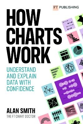
How Charts Work: Understand and explain data with confidence
Pearson Education Limited (Verlag)
978-1-292-34279-5 (ISBN)
How Charts Work brings the secrets of effective data visualisation in a way that will help you bring data alive.
Charts, graphs and tables are essential devices in business, but all too often they present information poorly. This book will help you:
Feel confident understanding different types of charts, graphs and tables – and how to read them
Recognise the true story behind the data presented and what the information really shows
Know the principles and rules of how best to represent information so you can create your own information-driven (and beautiful) visuals
Design visuals that people engage with, understand and act upon
Don't value design over information – present data persuasively.
Find the FT Chart Doctor's columns here - https://www.ft.com/chart-doctor
Alan Smith is Head of Visual and Data Journalism at Financial Times. A data visualization specialist, he writes the FT’s popular “Chart Doctor” column. Alan is an experienced presenter, having lectured extensively on how to communicate with data. His TEDx talk, “Why you should love statistics,” was a TED.com featured talk in 2017. Previously, he worked at the UK’s Office for National Statistics, where he founded its award-winning Data Visualisation Centre. Alan received a BA in geography from the University of Lancaster and holds an MSc in GIS from Salford University. He was appointed Officer of the Order of the British Empire (OBE) in Queen Elizabeth II’s 2011 Birthday Honours list.
Foreword Acknowledgements 1. Why you need this book 2. Why charts matter
PART 1 - KNOW YOUR CHARTS
3. The FT Visual Vocabulary 4. Charts of magnitude 5. Charts of change over time 6. Charts of correlation 7. Charts of distribution 8. Charts of flow 9. Charts of ranking 10. Charts of deviation 11. Charts of part to whole 12. Spatial is special
PART 2 - PUTTING CHARTS TO WORK
13. Using the Visual Vocabulary in your own organisation 14. The science behind good charts 15. Scales of justice, axes of evil 16. The best charts are well written 17. Designing for charts 18. Visualising uncertainty - a case study
| Erscheinungsdatum | 29.09.2022 |
|---|---|
| Verlagsort | Harlow |
| Sprache | englisch |
| Maße | 156 x 234 mm |
| Gewicht | 500 g |
| Themenwelt | Wirtschaft ► Betriebswirtschaft / Management ► Unternehmensführung / Management |
| ISBN-10 | 1-292-34279-X / 129234279X |
| ISBN-13 | 978-1-292-34279-5 / 9781292342795 |
| Zustand | Neuware |
| Haben Sie eine Frage zum Produkt? |
aus dem Bereich


