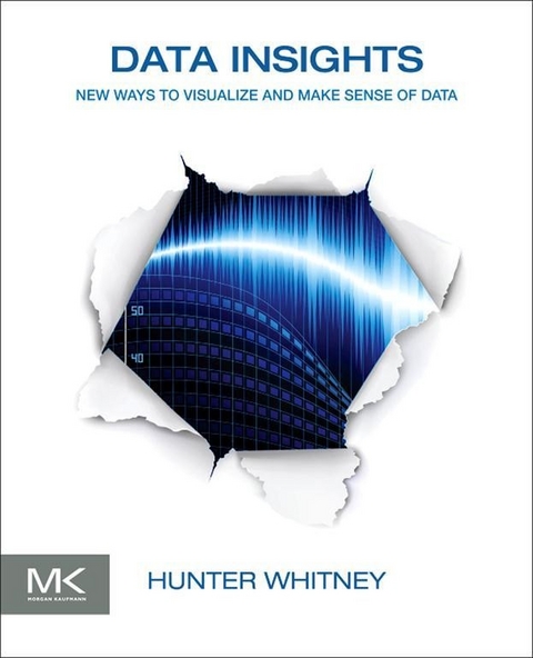
Organized into seven chapters, the book explores some of the ways that data visualization and other emerging approaches can make data meaningful and therefore useful. It also discusses some fundamental ideas and basic questions in the data lifecycle; the process of interactions between people, data, and displays that lead to better questions and more useful answers; and the fundamentals, origins, and purposes of the basic building blocks that are used in data visualization. The reader is introduced to tried and true approaches to understanding users in the context of user interface design, how communications can get distorted, and how data visualization is related to thinking machines. Finally, the book looks at the future of data visualization by assessing its strengths and weaknesses. Case studies from business analytics, healthcare, network monitoring, security, and games, among others, as well as illustrations, thought-provoking quotes, and real-world examples are included.
This book will prove useful to computer professionals, technical marketing professionals, content strategists, Web and product designers, and researchers.
- Demonstrates, with a variety of case studies, how visualizations can foster a clearer and more comprehensive understanding of data
- Answers the question, 'How can data visualization help me?' with discussions of how it fits into a wide array of purposes and situations
- Makes the case that data visualization is not just about technology; it also involves a deeply human process
Hunter Whitney is a User Experience (UX) Designer who has helped create useful and usable interface designs for clients in areas ranging from bioscience and medicine to information technology and marine biology. In addition to his UX work, he has written numerous articles about a range of subjects, including data visualization, for various online and print publications. His aim is to encourage conversations among people with diverse skills and perspectives about presenting data in ways that are more widely accessible and engaging. He received dual bachelor's degrees-one in English Literature from UCLA and the other in Biology from UCSC-and has completed post-graduate neuropsychology research at UCLA. The combination of these multidisciplinary studies reflects his longstanding interest in the intersection between the humanities and the sciences (www.hunterwhitney.com).
Data Insights: New Ways to Visualize and Make Sense of Data offers thought-provoking insights into how visualization can foster a clearer and more comprehensive understanding of data. The book offers perspectives from people with different backgrounds, including data scientists, statisticians, painters, and writers. It argues that all data is useless, or misleading, if we do not know what it means.Organized into seven chapters, the book explores some of the ways that data visualization and other emerging approaches can make data meaningful and therefore useful. It also discusses some fundamental ideas and basic questions in the data lifecycle; the process of interactions between people, data, and displays that lead to better questions and more useful answers; and the fundamentals, origins, and purposes of the basic building blocks that are used in data visualization. The reader is introduced to tried and true approaches to understanding users in the context of user interface design, how communications can get distorted, and how data visualization is related to thinking machines. Finally, the book looks at the future of data visualization by assessing its strengths and weaknesses. Case studies from business analytics, healthcare, network monitoring, security, and games, among others, as well as illustrations, thought-provoking quotes, and real-world examples are included.This book will prove useful to computer professionals, technical marketing professionals, content strategists, Web and product designers, and researchers. Demonstrates, with a variety of case studies, how visualizations can foster a clearer and more comprehensive understanding of data Answers the question, "e;How can data visualization help me?"e; with discussions of how it fits into a wide array of purposes and situations Makes the case that data visualization is not just about technology; it also involves a deeply human process
A More Beautiful Question
This chapter discusses the process of dynamic queries using data visualization tools. When working with data, meaningful answers sometimes only emerge through a series of interactions—question-and-answer (Q&A) feedback loops—and not from a single SQL statement. Analysis and discovery with data visualization tools can make it easier to initiate multiple threads of investigation that can grow, branch out, and be trimmed back over time. The visual feedback and level of interactivity that data visualizations provide can help us engage data without necessarily having to overly narrow down our questions at the outset. This chapter also introduces the idea of the full data lifecycle and the role it plays in the final results we see in visualizations. In the search for reliable answers and insights, it can be essential to have a sense of where the data came from and how it was transformed from the raw state to polished presentation.
Always the beautiful answer who asks a more beautiful question.
– e.e. cummings
FIGURE 2.1 All Over Coffee #507, Visitacion Valley, San Francisco, by Paul Madonna.
The Art of Inquiry
You can look at data visualizations from many different perspectives. For one, they can be seen as a means to arrive at answers to complex problems. But visualizations can play an even more essential role in sparking important questions that would not have arisen otherwise. When people begin problem solving, they may start off with a baseline set of assumptions and premises that are vague or misleading. To respond effectively in those cases, they may have to accept the idea that their initial set of ideas could be wrong or that the most important question to ask is one they never considered. The willingness to change one’s mind and the ability to respond with new sets of questions can be more useful than the skill of crafting queries that can prove to be irrelevant.
In this chapter, we’ll dive into the process of interactions between people, data, and displays that lead to better questions and more useful answers. If you’d like to first learn more about, or review, some of the basic building blocks of data visualization designs, please take a look at Chapter 3, and then come back.
We will explore two fundamental questions that visualizations can help answer: asking questions and weighing answers.
Asking questions
Sometimes, it can be challenging to know where to start with a question—make it too broad (e.g., “Where is the best place in the world for me to live?”) and you might not get back a useful response. Make it too narrow (e.g., “What is the best block for me to live on?”), and you may cut off important aspects of the results.
Data visualization tools can take some of the pressure off these decisions by making the precise entry questions into a data set less important. The ability to visually dive in and out of various layers of data on a map or social network diagram means you can work with the right density of detail for your needs. These tools have filters and feedback loops that can help in refining a general inquiry and point to the next steps. The feedback loops can be considerably shorter than the ones involving the queries that go from, say business intelligence (BI) teams to IT departments.
In addition, visualizations can provide a common platform for collaboratively generating and revising questions in ways that a more traditional process involving SQL statements cannot. The original question can be very broad—even potentially disposable—but helps set a question-and-answer (Q&A) process in motion that is more easily understood by all participants.
Weighing answers
You’ve succeeded in getting some interesting results from your investigation, but do the numbers add up? Among other things, it’s important to consider where the underlying data originated, how it was processed, and what it reveals. Data visualization tools can help you more easily identify, zoom in, and assess the underlying sources. The supporting facts should not be mere footnotes at the end of the article but, ideally, a clear and continually updated connection to the original material. For example, take the question of where to live mentioned before a step further.
Let’s say I’m considering moving to a new town, but it appears to have a high crime rate. If I took that one statistic at face value, I might knock it out of consideration. However, if I dug a little deeper, I would find it was part of an MSA (Metropolitan Statistical Area) with an overall high crime rate, but this area in particular was quite safe, and then I’d have a different attitude. Visualization tools can prompt me to ask about what I’m seeing and let me address those questions. This is an entirely different experience from simply looking up where the source material is buried.
Good Question
A good question is never answered. It is not a bolt to be tightened into place but a seed to be planted and to bear more seed toward the hope of greening the landscape of ideas.
– JOHN ANTHONY CIARDI
What makes a good question? Many times, the best questions are not necessarily the ones that lead to a single, direct answer. Instead, they invite conversations, counterpoints, and, ultimately, new insights. They enable a person’s ideas about a subject to expand and evolve. This kind of iterative Q&A process does not have to be just person-to-person; something analogous to this can happen with a combination of user, computer interface, and database.
Ben Shneiderman coined the term dynamic querying. By putting questions into interactive visual forms, we can easily see, save, and compare various versions of a single basic question as “snapshots.” Shneiderman says that the chart or graph is only a part of the whole visualization. The visible controls allow us to fluidly and effortlessly “fly through the databases.” With these tools, we can begin with a “big picture” and then quickly filter out the elements that are not of interest. As mentioned in Chapter 1, Shneiderman’s data visualization mantra is—“Overview first, zoom and filter, then details-on-demand.”
Dynamic querying can offer a more fluid and direct kind of experience for asking questions about data, compared with the typical use of SQL statements. For readers who are interested in the topic of data visualizations but are not necessarily familiar with all the terms tossed around by an IT department, SQL stands for “Structured Query Language.” It is a data manipulation programming language that works on relational databases and has been around since the 1970s. SQL is a way to ask questions of highly structured data and is an excellent way to retrieve things like airline flights or credit card transactions, but it’s not good for anything that isn’t contained in the neat rows and columns of a database or spreadsheet. Another shortcoming of SQL is that the relative complexity of the language means that even users who know the basics of SQL statements still generally need IT departments or database specialists to turn natural language questions into ones that are machine-readable statements.
Here’s a simple example:
Mary wants to look in her customer database for the names and addresses of everyone who became a customer before the year 2000. The SQL for this question is as follows:
SELECT firstname, lastname, street, city, state, zip;FROM customer_list;WHERE join_date < 1/1/2000;Large and complicated SQL statements can take up pages and pages of space when printed out of a standard office printer. This kind of approach, although often useful and necessary, can make the process of getting answers from data more stilted and difficult.
Washington, D.C.’s 1100 Points of Light
One example of a tool for dynamic queries is embodied in the “DC HomeFinder,” which I think of as an archetypal and elegant data visualization tool. This type of interface is called a Starfield display, and this particular one was created in the early 1990s. It displayed regional housing data and presented, in a visual format, the homes on the market. It was an inspiration to me as I was starting out on my interactive design career path in the late ’90s; it also shows that people have been working on interesting approaches to visualization longer than we might think.
The DC HomeFinder was created by Christopher Williamson, under the auspices of Ben Shneiderman, at the University of Maryland Human-Computer Interaction Lab (www.cs.umd.edu/hcil/spotfire). It showed a map of Washington, D.C. and, as one Shneiderman description of the tool puts it, “1100 points of light indicating homes for sale” (Figure 2.2). Slider controls allow the rapid selection of the number of bedrooms and cost, and buttons select air conditioning, garage, and other features. Within seconds, users could see how many homes matched their query and adjust accordingly. Shneiderman writes:
One of the amusing stories about this project was the unwillingness of corporate or university sources for regional housing information to share their data. Undaunted, Chris Williamson and his friends took a Sunday Washington Post and typed in the data for the 1100 homes. One of the amazing stories is the resistance...
| Erscheint lt. Verlag | 27.11.2012 |
|---|---|
| Sprache | englisch |
| Themenwelt | Mathematik / Informatik ► Informatik ► Grafik / Design |
| Informatik ► Software Entwicklung ► User Interfaces (HCI) | |
| Mathematik / Informatik ► Mathematik | |
| Technik | |
| Wirtschaft ► Betriebswirtschaft / Management | |
| ISBN-10 | 0-12-387794-6 / 0123877946 |
| ISBN-13 | 978-0-12-387794-9 / 9780123877949 |
| Haben Sie eine Frage zum Produkt? |
Größe: 34,4 MB
Kopierschutz: Adobe-DRM
Adobe-DRM ist ein Kopierschutz, der das eBook vor Mißbrauch schützen soll. Dabei wird das eBook bereits beim Download auf Ihre persönliche Adobe-ID autorisiert. Lesen können Sie das eBook dann nur auf den Geräten, welche ebenfalls auf Ihre Adobe-ID registriert sind.
Details zum Adobe-DRM
Dateiformat: PDF (Portable Document Format)
Mit einem festen Seitenlayout eignet sich die PDF besonders für Fachbücher mit Spalten, Tabellen und Abbildungen. Eine PDF kann auf fast allen Geräten angezeigt werden, ist aber für kleine Displays (Smartphone, eReader) nur eingeschränkt geeignet.
Systemvoraussetzungen:
PC/Mac: Mit einem PC oder Mac können Sie dieses eBook lesen. Sie benötigen eine
eReader: Dieses eBook kann mit (fast) allen eBook-Readern gelesen werden. Mit dem amazon-Kindle ist es aber nicht kompatibel.
Smartphone/Tablet: Egal ob Apple oder Android, dieses eBook können Sie lesen. Sie benötigen eine
Geräteliste und zusätzliche Hinweise
Buying eBooks from abroad
For tax law reasons we can sell eBooks just within Germany and Switzerland. Regrettably we cannot fulfill eBook-orders from other countries.
Kopierschutz: Adobe-DRM
Adobe-DRM ist ein Kopierschutz, der das eBook vor Mißbrauch schützen soll. Dabei wird das eBook bereits beim Download auf Ihre persönliche Adobe-ID autorisiert. Lesen können Sie das eBook dann nur auf den Geräten, welche ebenfalls auf Ihre Adobe-ID registriert sind.
Details zum Adobe-DRM
Dateiformat: EPUB (Electronic Publication)
EPUB ist ein offener Standard für eBooks und eignet sich besonders zur Darstellung von Belletristik und Sachbüchern. Der Fließtext wird dynamisch an die Display- und Schriftgröße angepasst. Auch für mobile Lesegeräte ist EPUB daher gut geeignet.
Systemvoraussetzungen:
PC/Mac: Mit einem PC oder Mac können Sie dieses eBook lesen. Sie benötigen eine
eReader: Dieses eBook kann mit (fast) allen eBook-Readern gelesen werden. Mit dem amazon-Kindle ist es aber nicht kompatibel.
Smartphone/Tablet: Egal ob Apple oder Android, dieses eBook können Sie lesen. Sie benötigen eine
Geräteliste und zusätzliche Hinweise
Buying eBooks from abroad
For tax law reasons we can sell eBooks just within Germany and Switzerland. Regrettably we cannot fulfill eBook-orders from other countries.
aus dem Bereich


