Developing Quality Technical Information
IBM Press (Verlag)
978-0-13-147749-0 (ISBN)
- Titel erscheint in neuer Auflage
- Artikel merken
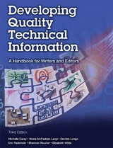
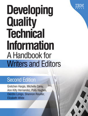
The book presents a much needed approach to quality technical communication and a working plan for achieving quality. The examples are excellent and are easy to use and adapt. The editorial advice is simple and clear enough for tech writers who did not major in English or journalism. It is most worthy of a text in university programs, but it is more valuable to experienced writers, editors and managers concerned with raising the quality of their publications. The main difference between this and other books is that in each of the first nine chapters, one quality characteristic is presented that you can apply to your writing project to make technical information easy to use, easy to understand and easy to find. There are checklists at the end of each chapter for review and a Quality checklist in the appendix covering all of the characteristics. The book shows original text and revision text so that you can actually browse the book and see the differences applied. This is another excellent feature that should catch a purchaser's eye.
The authors have served on the Editing Council at IBM Silicon Valley Laboratory in San Jose, California, an organization dedicated to excellence in technical information. Gretchen Hargis is a technical manager at IBM for a group that provides user assistance and user-centered design for application development tools. She was a technical editor and writer and a pioneer of IBM Darwin Information Typing Architecture (DITA). Michelle Carey is a technical writer at IBM and a technical writing instructor at University of California Santa Cruz Extension. She is an expert on topic-based information systems and on writing for international audiences. Ann Kilty Hernandez is a technical editor at IBM and has been a technical writer, manager, and marketing specialist. She was a co-author of An Introduction to DB2 for OS/390 and contributed to its next edition, The Official Guide to DB2 UDB for z/OS. Polly Hughes, now retired from IBM, worked as a visual designer for technical information and software interfaces and as a technical writer. Deirdre Longo is a technical editor and writer at IBM who edits product interfaces and writes customer information, mostly for content management products. Shannon Rouiller is a technical editor at IBM who has written and edited topicbased information systems, books, contextual help, wizards, and interfaces for products that are marketed worldwide. She co-authored Designing Effective Wizards. Elizabeth Wilde is a technical editor at IBM and a leader in developing quality metrics and quality assurance processes for technical documentation. She also educates writers and editors throughout IBM on developing user-centered information.
Welcome.
Is this book for you? How to use this book. Conventions used in this book. Changes in this edition.
Acknowledgments.
1. Quality technical information.
What is quality technical information? Relationships among the quality characteristics. Order of the groups. Quality characteristics compared with elements and guidelines. Other possible quality characteristics of technical information. Using the quality characteristics to develop quality technical information. Preparing to write: understanding users, tasks, and the product. Writing and rewriting. Reviewing, testing, and evaluating technical information. Writing task, concept, and reference topics. Establishing a unit of reuse. Restructuring technical information.
I. EASY TO USE.
2. Task orientation.
Write for the intended audience. Present information from the user's point of view. Indicate a practical reason for information. Relate details to a task where appropriate. Provide only a necessary amount of conceptual information in task topics. Focus on real tasks, not product functions. Use headings that reveal the tasks. Divide tasks into discrete subtasks. Provide clear, step-by-step instructions. Make each step a clear action for users to take. Group steps for usability. Clearly identify optional steps. Identify criteria at the beginning of conditional steps. In sum.
3. Accuracy.
Write information only when you understand it, and then verify it. Keep up with technical changes. Maintain consistency of all information about a subject. Reuse information when possible. Avoid introducing inconsistencies and eliminate those that you find. Use tools that automate checking for accuracy. Check the accuracy of references to related information. In sum.
4. Completeness.
Cover all topics that support users' tasks, and only those topics. Cover each topic in just as much detail as users need. Include enough information. Include only necessary information. Use patterns of information to ensure proper coverage. Repeat information only when users will benefit from it. In sum.
II. EASY TO UNDERSTAND.
5. Clarity.
Focus on the meaning. Avoid ambiguity. Use words with a clear meaning. Avoid vague referents. Place modifiers appropriately. Avoid long strings of nouns. Write positively. Make the syntax of sentences clear. Keep elements short. Remove roundabout expressions and needless repetition. Choose direct words. Keep lists short. Write cohesively. Present similar information in a similar way. Use lists appropriately. Segment information into tables. Use technical terms only if they are necessary and appropriate. Decide whether to use a term. Use terms consistently. Define each term that is new to the intended audience. In sum.
6. Concreteness.
Choose examples that are appropriate for the audience and subject. Consider the level and needs of users. Use examples appropriately in conceptual, task, and reference information. Use focused, realistic, accurate, up-to-date examples. Make examples easy to find. Use visual cues to indicate where examples are. Make examples part of the user interface. Make clear where examples start and stop. Make code examples easy to adapt. Use scenarios to illustrate tasks and to provide overviews. Set the context for examples and scenarios. Relate unfamiliar information to familiar information. Use general language appropriately. In sum.
7. Style.
Use correct grammar. Check for sentence fragments. Correct pronoun problems. Correct dangling modifiers. Use correct and consistent spelling. Use consistent and appropriate punctuation. Write with the appropriate tone. Use an active style. Use active voice. Use the present tense. Use the appropriate mood. Follow template designs and use boilerplate text. Create and reuse templates. Use boilerplate text to ensure inclusion of necessary information. Create and follow style guidelines. Provide practical and consistent highlighting. Present list items consistently. Use unbiased language. In sum.
III. EASY TO FIND.
8. Organization.
Organize information into discrete topics by type. Organize tasks by order of use. Organize topics for quick retrieval. Separate contextual information from other types of information. Organize information consistently. Provide an appropriate number of subentries for each branch. Emphasize main points; subordinate secondary points. Reveal how the pieces fit together. In sum.
9. Retrievability.
Facilitate navigation and search. Provide a complete and consistent index. Use an appropriate level of detail in the table of contents. Provide helpful entry points. Link appropriately. Design helpful links. Ensure that a link describes the information that it links to. In similar links and cross-references, emphasize the text that is different. Minimize the effort that is needed to reach related information. Avoid redundant links. Make linked-to information easy to find in the target topic. In sum.
10. Visual effectiveness.
Use graphics that are meaningful and appropriate. Illustrate significant concepts. Avoid illustrating what is already visible. Choose graphics that complement the text. Use visual elements for emphasis. Emphasize the appropriate information. Ensure that your visual elements are not distracting. Use visual elements logically and consistently. Use a visually simple but distinct heading hierarchy. Maintain consistent placement of document elements. Ensure that the look and feel of multimedia presentations is consistent. Use icons and symbols consistently. Balance the number and placement of visual elements. Use visual cues to help users find what they need. Visually identify recurring alternatives or contexts. Ensure that visual cues are usable in all environments. Ensure that textual elements are legible. Use a legible typeface and size. Ensure that the text fits in the available space. Ensure that the contrast between text and background is adequate. Use color and shading discreetly and appropriately. Ensure that all users can access the information. In sum.
IV. PUTTING IT ALL TOGETHER.
11. Applying more than one quality characteristic.
Applying quality characteristics to task information. Applying quality characteristics to conceptual information. Applying quality characteristics to reference information. Applying quality characteristics to information for an international audience. Applying quality characteristics to information on the Web351 Revising technical information.
12. Reviewing, testing, and evaluating technical information.
Inspecting technical information. Reading and using the information. Finding problems. Reporting problems. Testing information for usability. Prototyping. Testing outside a usability laboratory. Testing in a usability laboratory. Testing technical information. Using test tools. Using test cases. Testing the user interface. Editing and evaluating technical information. Preparing to edit. Getting an overview. Reading and editing the information. Looking for specific information. Summarizing your findings. Conferring with the writer. Reviewing the visual elements. Preparing to review. Getting an overview. Reviewing individual visual elements. Summarizing your findings. Conferring with the editor or writer or both.
V. APPENDIXES.
Appendix A: Quality checklist.
Appendix B: Who checks which quality characteristics?
Appendix C: Quality characteristics and elements.
Looking at the quality characteristics. Looking at the elements. Resources and references. Easy to use. Easy to understand. Easy to find. Putting it all together.
Glossary.
Index.
| Erscheint lt. Verlag | 22.4.2004 |
|---|---|
| Verlagsort | Armonk |
| Sprache | englisch |
| Maße | 100 x 100 mm |
| Gewicht | 100 g |
| Themenwelt | Schulbuch / Wörterbuch ► Wörterbuch / Fremdsprachen |
| Geisteswissenschaften ► Sprach- / Literaturwissenschaft ► Sprachwissenschaft | |
| Mathematik / Informatik ► Informatik ► Software Entwicklung | |
| ISBN-10 | 0-13-147749-8 / 0131477498 |
| ISBN-13 | 978-0-13-147749-0 / 9780131477490 |
| Zustand | Neuware |
| Haben Sie eine Frage zum Produkt? |
aus dem Bereich
