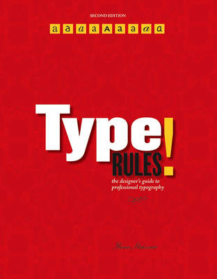
Type Rules!
John Wiley & Sons Inc (Verlag)
978-0-471-72114-7 (ISBN)
- Titel ist leider vergriffen;
keine Neuauflage - Artikel merken
This new Second Edition also includes three new features: * Tech Tips-Instructional sidebars that succinctly explain how to achieve the covered typographic principles and techniques * Type Tips-Expert tips and helpful hints that offer insightful details on covered topics * Educational Supplements-Exercises and assignments that reinforce material and show how to apply techniques in the real world
ILENE STRIZVER is the founder of The Type Studio in Westport, Connecticut. She writes and teaches extensively on typography. During her career, she's been creative and production director of Upper & lowercase (U&lc) and director of typeface development at International Typeface Corporation (ITC) in New York City, where she developed more than 300 text and display typefaces with such respected type designers as Summer Stone, Erik Spiekermann, Jill Bell, Jim Parkinson, and the late Phill Grimshaw.
Preface. Acknowledgments. Introduction. Chapter 1: A Brief History of Type. Sounds to Symbols. Gutenberg and Movable Type. Phototype. Herb Lubalin. Into the Digital Age. Exercises: Design Guidelines, Nancy Sharon Collins. Historical Design, Ilene Strizver. Typographic Timeline, Ilene Strizver. Chapter 2: From Metal to Mac: Understanding Font Technology. What is a Font? Font Formats. Type 1 (or PostScript) Fonts. TrueType Fonts. OpenType Fonts. Hinting. Font Management Utilities. Techtip: Font Icons. Typetip: Style-Linked Fonts. Exercise: Keyboard Layout Charts, Ilene Strizver. Chapter 3: What Makes a Typeface Look the Way It Does? Parts of a Character. Type Categories. Serif. Sans Serif. Scripts. Handwriting. Blackletter. Titling Fonts. Decorative and Display. Typetip: One- and Two-storey "a"s and "g"s. Exercises: Think Like a Type Designer, Ilene Strizver. Personal Type Specimen Book (Individual Project), Ilene Strizver. Type Specimen Book and Typeface Analysis (Group Project), Audrey G. Bennett. On Beyond Zebra: The 27th Letter Assignment, Virginia Rougon Chavis. Chapter 4: Selecting the Right Type for the Job. Design Goals. Legibility and Readability. What Makes a Good Typeface? Text vs. Display. Typographic Illustration. Script, Calligraphic, and Handwriting Fonts. When the Best Font for the Job Isn't a Font. Type Families. Dos and Don'ts. Mixing It Up. Typetip: Type Specimens. Typetip: A Bodoni by Any Other Name... Exercises: A Garamond is a Garamond is a Garamond...or is It? Ilene Strizver. Why Are All the Scary Typefaces Pointy? Christopher Andreola. Legibility and Readability Study, Peter Bain, Ilene Strizver. Chapter 5: Basic Techniques for Emphasis. Italics. Boldface (or Weight Contrast). Underscores. Techtip: Underlines in QuarkXPress. Point Size. Cap vs. Lowercase. Wide vs. Narrow. Changing Typestyle. Changing Color or Shade. Exercises: Typographic Hierarchy Study, Elizabeth Resnick. Currency Redesign, Jimmy Moss. Chapter 6: Advanced Techniques for Emphasis. Initial Caps. Small Caps. Oldstyle Figures. Indents. Ligatures. Techtip: Ligatures in QuarkXPress. Swash Characters. Alternate Characters. Techtip: Glyph Palettes. Exercise: Expressive Typography, Stephanie Nace. Chapter 7: Basic Fine-Tuning and Tweaking. Type Size. Line Length. Line Spacing (Leading). Techtip: Auto Leading. Alignment. A Few Words About Rags. Widows and Orphans. Typetip: Adobe Text Composer. Typetip: Baseline Shift. Techtip: Baseline Shift in Adobe InDesign & QuarkXPress. Exercises: Concert Poster Design, Frank Armstrong. Information Hierarchy Book, David Kadavy. Chapter 8: Advanced Fine-Tuning and Tweaking. Hyphenation. Techtip: Discretionary Hyphens. Hung Punctuation (or Optical Alignment). Techtip: Hung Punctuation in Adobe InDesign. Visual Alignment. Typetip: Type on a Curve. Kerning. Typetip: Kerning Units. Techtip: Adjusting Kerning. Typetip: Proportional vs. Tabular Figures. Techtip: Adjusting Tracking. Tracking (or Letterspacing). Techtip: Adjusting Word Spacing. Word Spacing. Exercises: Type Poster, David Kadavy. Spacing, Kerning, and Visual Alignment Exploration, Ilene Strizver. Chapter 9: Typographic Typos and How To Avoid Them. Hyphen, En Dash, and Em Dash. Quotation Marks. Techtip: Smart Quotes. Typetip: Smarten-up Your Quotes Manually. Apostrophes. Spaces. Exercise: Editorial Design, Ilene Strizver. Chapter 10: Signs, Symbols, and Dingbats. Register, Trademark, and Copyright Symbols. Bullets. Ellipses. Parentheses, Brackets, Braces, and Angled Brackets. Accents. Typetip: Creating Accented Characters. Euro. Fractions. Techtip: Fractions in QuarkXPress. Typetip: Build Your Own Fractions. ITC Zapf Dingbats. Exercises: Typographic Principles Card Set, Regina Rowland. Spa Brochure, Ilene Strizver. Chapter 11: Designing Your Own Typeface. Handwriting Fonts: A Good Place to Begin. Three Approaches to Designing a Typeface. Professional Guidelines. Exercises: Introduction to Type Design: Symphony, James Montalbano. Digitize Your Signature, James Montalbano. Glossary. Bibliography. Picture Credits. Digital Font Foundries. Index.
| Erscheint lt. Verlag | 4.4.2006 |
|---|---|
| Zusatzinfo | Illustrations (some col.) |
| Verlagsort | New York |
| Sprache | englisch |
| Maße | 215 x 273 mm |
| Gewicht | 547 g |
| Einbandart | Paperback |
| Themenwelt | Kunst / Musik / Theater ► Design / Innenarchitektur / Mode |
| Informatik ► Grafik / Design ► Desktop Publishing / Typographie | |
| ISBN-10 | 0-471-72114-X / 047172114X |
| ISBN-13 | 978-0-471-72114-7 / 9780471721147 |
| Zustand | Neuware |
| Informationen gemäß Produktsicherheitsverordnung (GPSR) | |
| Haben Sie eine Frage zum Produkt? |
aus dem Bereich


