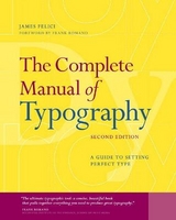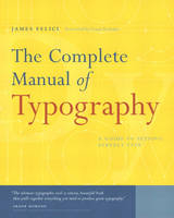
The Complete Manual of Typography
Adobe Press,U.S. (Verlag)
978-0-321-12730-3 (ISBN)
- Titel erscheint in neuer Auflage
- Artikel merken
Testimonials
"The ultimate typographic tool: a concise, beautiful book that pulls together everything you need to produce great typography."
--Frank Romano, RIT School of Print Media
"Clear and elegant...There's no better or more useful introduction to the whole craft of typography."
--Roger Black, Danilo Black, Inc.
"All you've always wanted to know about type and typography but never dared to ask. Jim Felici brings together a vast amount of knowledge in this book. Must-have!"
--Erik Spiekermann, author, Stop Stealing Sheep (and Find Out How Type Works)
This book is about how type should look and how to make it look that way; in other words, how to set type like a professional. It releases the craft knowledge that used to reside almost exclusively in the heads of people working in type shops. The shops are gone, the technologies have changed, but the goal remains the same. This book explains in very practical terms how to use today's computerized tools to achieve that secret of good design: well-set type.
Beautifully designed and richly illustrated, The Complete Manual of Typography is an essential reference for anyone who works with type. Designers, print production professionals, and corporate communications managers can go straight to the index to find focused answers to specific questions, while educators and students can read it as a textbook from cover to cover. You'll find:
History, basic concepts, and anatomy of good typography, concisely presented and indexed for quick reference by busy professionals.
Straight-ahead instructions for how to manage fonts, handle corrupted or missing fonts, and find the characters you need.
Clear, useful explanations of what makes good type good (and bad type bad) .
Detailed guidance on controlling the fundamentals of type, including measure, point size, leading, kerning, and hyphenation and justification.
Practical advice on how to fix and avoid composition problems such as loose lines, bad rags, widows and orphans.
Hard-to-find rules for managing indents and alignments, skews, wraps, expert-set characters, and tables.
Scores of workarounds that show how to wring good type out of uncooperative word-processing and layout programs.
James Felici has worked in the publishing industry-in both editorial and production-for over 30 years. A veteran journalist and former managing editor of Publish magazine, he has set type by hand as well as on systems from IBM, Linotype, Compugraphic, CCI, and Magna. His other books include The Desktop Style Guide (Bantam/ITC), How to Get Great Type Out of Your Computer (North Light), and contributions to The Macintosh Bible (Peachpit Press). He writes for numerous publications including PC World,Macworld, and The Seybold Report, and is a featured speaker at Seybold Seminars, Macworld Expo, and other events worldwide.
Foreword.
Introduction.
I. TYPOGRAPHIC BASICS.
1. The State of the Art and How We Got Here.
The Building Blocks of Type. Evolution and Automation. Desktop Publishing Alters the Rules. Output Resolution and Type Quality.
2. Units of Typographic Measurement.
Absolute Measurements. Relative Units. Other Units of Measure.
3. About Typefaces.
Definitions: Font versus Typeface. Type Design and the Em Square. Type Anatomy. Optical Aspects of Typeface Design. Size Changes Everything. Principal Features of Typefaces. Typefaces as Role Players: Text, Display, and Decorative. Classifying Typefaces by Historical Period. Typeface-Naming Issues.
4. About Fonts.
The Two Basic Kinds of Fonts: Outline and Bitmapped. What's in a Font? Cross-Platform Font—Compatibility Issues. Finding the Characters You Need. Identifying Font Formats. The Basics of Font Management. Font-Editing Programs.
5. The Basics of Using Typefaces.
Readability. Traditional Roles for Seriffed and Sans Serif Types. Expressing Emphasis. Uses for Condensed and Extended Faces. Using Display Type. Using Decorative Type. Type in Color. Reverses.
6. Typesetting versus Typewriting.
Pages Sizes and Line Lengths. Word Spaces. Line Endings and Carriage Returns. Typeface Choice and Point Size. Unavailable Characters. Tabs.
7. Setting Type on a Personal Computer.
Typesetting and the Word Processing Legacy. How WYSIWYG Works. How Operating Systems Manage Fonts. Font Embedding. Font Copyright Issues.
8. What Make Good Type Good (and Bad Type Bad).
Legibility and Readability. Type Color. Optical Effects and Alignment Problems. The Eyes Have It.
II. HOW TO SET TYPE.
9. Measure, Point Size, and Leading.
Line Length, or Measure. Leading. Typeface-Specific Considerations.
10. Controlling Hyphenation and Justification.
What Hyphenation and Justification Means. Controlling Word and Letter Spaces. Controlling Hyphenation. How Measure Affects H&J. Specifying Word-Space Ranges in Ragged-Margin Type. Specifying Word-Space Ranges in Text with Justified Margins. Specifying Letter-Space Ranges. Altering Character Widths during H&J. Testing Your H&J Values. Fixing and Avoiding Composition Problems. Aesthetic Rags.
11. Kerning and Tracking.
Definitions: Kerning and Tracking. Kerning in Practice. Using Tracking Controls.
12. Managing Indention and Alignment.
Kinds of Indents. Skews and Wraps. Alignments of Characters and Text Blocks. Visual Alignment.
13. Special Characters and Special Situations.
Extended Character Sets. Small Capitals. Old-Style Numbers. Ligatures, Logotypes, and Diphthongs. Swash Characters. Superiors, Inferiors, and Ordinals. Fractions. Dashes. Points of Ellipsis. Common Pi Characters. Accented Characters. Character-Specific Spacing Issues. Initial Capitals.
14. Document Structures and Typographic Conventions.
Structural Elements. Navigation Tools. Independent Text Units. Indexes. Bibliographies.
15. Tables.
The Structure of Tables. Table-Setting Techniques. Faking It.
16. Language-Specific Issues.
Character Sets. Hyphenation. Time Expressions. Currency Symbols. British English versus American English. French Typographic Conventions. Spanish Typographic Conventions. Italian Typographic Conventions. German Typographic Conventions.
17. Typesetting with Style Sheets.
How Style Sheets Work. Creating Style Sheets. Using Style Sheets.
18. Output-Resolution Issues.
The Advantages of High-Resolution Output. Type Onscreen. Typography and the World Wide Web.
Glossary. Index. Further Reading.
| Erscheint lt. Verlag | 4.10.2002 |
|---|---|
| Verlagsort | Indianapolis |
| Sprache | englisch |
| Maße | 253 x 205 mm |
| Gewicht | 692 g |
| Themenwelt | Kunst / Musik / Theater ► Design / Innenarchitektur / Mode |
| Informatik ► Grafik / Design ► Desktop Publishing / Typographie | |
| ISBN-10 | 0-321-12730-7 / 0321127307 |
| ISBN-13 | 978-0-321-12730-3 / 9780321127303 |
| Zustand | Neuware |
| Informationen gemäß Produktsicherheitsverordnung (GPSR) | |
| Haben Sie eine Frage zum Produkt? |
aus dem Bereich
