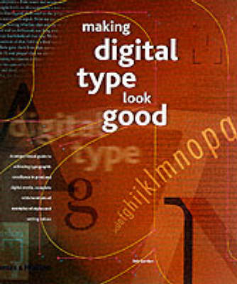
Making Digital Type Look Good
Seiten
2001
Thames & Hudson Ltd (Verlag)
978-0-500-28313-4 (ISBN)
Thames & Hudson Ltd (Verlag)
978-0-500-28313-4 (ISBN)
- Titel ist leider vergriffen;
keine Neuauflage - Artikel merken
A comprehensive analysis of digital typography, complete with hundreds of examples of styles and setting values, that aims to be the essential reference for anyone involved with digital output. This guide includes a full synopsis of each weight and style, and a review of font technology.
A comprehensive analysis of digital typography, complete with hundreds of examples of styles and setting values, that aims to be the essential reference for anyone involved with digital output. This guide includes a full synopsis of each weight and style, and a review of the current state of font technology. The advent of digital typography has brought a huge range of customizable features for the typographer, as well as providing obvious benefits to the designer - for example, infinitely variable kerning values. However, such a vast range of features makes comparison of different settings a necessity because what you see on screen is frequently not what you get on paper. In the days of metal typesetting, every typeface designed and issued by a foundry was accompanied by detailed specimen sheets displaying examples of every conceivable permutation of setting: type style, weight, sizes, numerals, and so on. This book meets the needs of contemporary practitioners by providing a host of specimens of the abundant range of settings available through design software.
A comprehensive analysis of digital typography, complete with hundreds of examples of styles and setting values, that aims to be the essential reference for anyone involved with digital output. This guide includes a full synopsis of each weight and style, and a review of the current state of font technology. The advent of digital typography has brought a huge range of customizable features for the typographer, as well as providing obvious benefits to the designer - for example, infinitely variable kerning values. However, such a vast range of features makes comparison of different settings a necessity because what you see on screen is frequently not what you get on paper. In the days of metal typesetting, every typeface designed and issued by a foundry was accompanied by detailed specimen sheets displaying examples of every conceivable permutation of setting: type style, weight, sizes, numerals, and so on. This book meets the needs of contemporary practitioners by providing a host of specimens of the abundant range of settings available through design software.
Bob Gordon is a senior lecturer in graphic design and typography, with over 40 years of industry experience.
Part One: How Digital Typography Works - From wood to postcript * Word spacing, letter spacing * 'Hyphenation' and 'Justification' values Part Two: Text Setting - Comprehensive examples * Wide range of popular serif and sans serif * Fonts displayed (style, measure, weight, etc) * Full spread dedicated to each font * Every weight or width variation treated separately Part Three: Display Setting - How to achieve optimum results when using large sizes * Examples include: size; weight; tracking; kerning * Digital display (web, multimedia, etc)
| Erscheint lt. Verlag | 29.10.2001 |
|---|---|
| Zusatzinfo | 516 colour illustrations |
| Verlagsort | London |
| Sprache | englisch |
| Maße | 237 x 262 mm |
| Gewicht | 920 g |
| Themenwelt | Kunst / Musik / Theater ► Design / Innenarchitektur / Mode |
| Informatik ► Grafik / Design ► Desktop Publishing / Typographie | |
| Mathematik / Informatik ► Informatik ► Theorie / Studium | |
| ISBN-10 | 0-500-28313-3 / 0500283133 |
| ISBN-13 | 978-0-500-28313-4 / 9780500283134 |
| Zustand | Neuware |
| Haben Sie eine Frage zum Produkt? |
Mehr entdecken
aus dem Bereich
aus dem Bereich


