The Geometry of Type
The Anatomy of 100 Essential Typefaces
Seiten
2013
Thames & Hudson Ltd (Verlag)
978-0-500-24142-4 (ISBN)
Thames & Hudson Ltd (Verlag)
978-0-500-24142-4 (ISBN)
- Titel ist leider vergriffen;
keine Neuauflage - Artikel merken
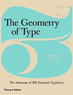
Explores 100 traditional and modern typefaces in loving detail, with a full spread devoted to each entry. In this title, characters from each typeface are enlarged and annotated to reveal key features, anatomical details, and the finer, often-overlooked elements of type design, which shows how these attributes affect mood and readability.
The Geometry of Type explores 100 traditional and modern typefaces in loving detail, with a full spread devoted to each entry. Characters from each typeface are enlarged and annotated to reveal key features, anatomical details, and the finer, often-overlooked elements of type design, which shows how these attributes affect mood and readability. Sidebar information lists the designer and foundry, the year of release and the different weights and styles available, while feature boxes explain the origins and best uses for each typeface, such as whether it is suitable for running text or as a display font for headlines. To help the reader spot each typeface in the wider world, the full character set is shown, and the best letters for identification are highlighted. This beautiful and highly practical work of reference for font spotters, designers and users is a close-up celebration of typefaces and great type design.
The Geometry of Type explores 100 traditional and modern typefaces in loving detail, with a full spread devoted to each entry. Characters from each typeface are enlarged and annotated to reveal key features, anatomical details, and the finer, often-overlooked elements of type design, which shows how these attributes affect mood and readability. Sidebar information lists the designer and foundry, the year of release and the different weights and styles available, while feature boxes explain the origins and best uses for each typeface, such as whether it is suitable for running text or as a display font for headlines. To help the reader spot each typeface in the wider world, the full character set is shown, and the best letters for identification are highlighted. This beautiful and highly practical work of reference for font spotters, designers and users is a close-up celebration of typefaces and great type design.
Stephen Coles is a writer and typographer. After six years as creative director at FontShop in San Francisco, he now edits the websites Typographica, Fonts In Use and The Mid-Century Modernist. Stephen is a regular contributor to The Print and The Codex magazines, a Type Camp instructor and a member of the FontFont TypeBoard. He also contributed editorial content to the most recent edition of FontBook: Digital Typeface Compendium.
| Erscheint lt. Verlag | 7.1.2013 |
|---|---|
| Zusatzinfo | Illustrated in colour throughout |
| Verlagsort | London |
| Sprache | englisch |
| Maße | 190 x 245 mm |
| Themenwelt | Kunst / Musik / Theater ► Design / Innenarchitektur / Mode |
| Informatik ► Grafik / Design ► Desktop Publishing / Typographie | |
| ISBN-10 | 0-500-24142-2 / 0500241422 |
| ISBN-13 | 978-0-500-24142-4 / 9780500241424 |
| Zustand | Neuware |
| Haben Sie eine Frage zum Produkt? |
Mehr entdecken
aus dem Bereich
aus dem Bereich
