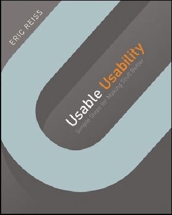
Usable Usability
John Wiley & Sons Inc (Verlag)
978-1-118-18547-6 (ISBN)
- Titel ist leider vergriffen;
keine Neuauflage - Artikel merken
The A-to-Z guide to spotting and fixing usability problems Frustrated by pop-ups? Forms that make you start over if you miss a field? Nonsensical error messages? You're not alone! This book helps you simply get it right the first time (or fix what's broken). Boasting a full-color interior packed with design and layout examples, this book teaches you how to understand a user's needs, divulges techniques for exceeding a user's expectations, and provides a host of hard won advice for improving the overall quality of a user's experience. World-renowned UX guru Eric Reiss shares his knowledge from decades of experience making products useable for everyone...all in an engaging, easy-to-apply manner.
Reveals proven tools that simply make products better, from the users' perspective
Provides simple guidelines and checklists to help you evaluate and improve your own products
Zeroes in on essential elements to consider when planning a product, such as its functionality and responsiveness, whether or not it is ergonomic, making it foolproof, and more
Addresses considerations for product clarity, including its visibility, understandability, logicalness, consistency, and predictability
Usable Usability walks you through numerous techniques that will help ensure happy customers and successful products!
ABOUT THE AUTHOR Eric Reiss has been meddling with service- and product-design projects for longer than he cares to remember. Today, he is CEO of The FatDUX Group, an international user-experience design company headquartered in Copenhagen, Denmark. Eric has also lectured on design principles at the Bauhaus University in Weimar, is a former Professor of Usability and Design at the IE Business School in Madrid, and serves on the advisory boards of several universities and institutes in both Europe and the United States. His Web Dogma, a design philosophy that transcends both fashion and technology, has been adopted by thousands of developers and companies around the world. You can follow Eric Reiss on Twitter: @elreiss
Introduction xvii
Part One 1
Chapter One Functional 3
The three keys to functionality 5
From click to conversion: making sure the buttons work 6
Browser wars, hardware headaches 7
Don’t sweat the home page. Fine-tune your forms 8
Four keys to creating functional forms 9
Required fields 9
Forms and business rules 10
Interdependent forms 11
Instructions and functionality 12
Navigation: Getting folks where they want to go 14
My crappy new TV 14
Understand your goals and keep them in focus 15
A true story about a fairy tale 15
Functionality can change over time 17
A complaint is a gift 18
The Donation That Couldn’t Be Made: A Tale from the Trenches 19
Chapter Two Responsive 25
The myth of two-way communication 26
Three traditional keys to responsiveness 26
A fourth view: “Responsive design” 27
“Wake up, you stupid machine!” 30
A closer look at transitional techniques 33
Transitional techniques and physical objects 35
Response mechanisms in the online environment 35
Response mechanisms in physical objects 37
OOPS ! I JUS T ORDERED THREE ROLLS -ROYCES : A TALE FROM THE TRENCHES 39
Chapter Three Ergonomic 43
Henry Dreyfuss: Introducing ergonomics to industrial design 44
Buttons: Why bigger sometimes is better 46
Milliseconds count 48
Bring on the scientists 49
“First word after the bullet” 50
Tabs and other keyboard shortcuts 53
Provide clearance 54
“Go to the back of the line” 55
Improve work organization 56
Eric and the IRS 56
The “silent usher” 58
FLOWERS THAT BLOOM ON THE SCREEN : A TALE FROM THE TRENCHES 60
Chapter Four Convenient 63
Giving inconvenience a positive spin 64
Eric’s advice for the lovelorn 66
Multimodal experiences 66
Switching routines 67
Why I hate calling my bank 68
Switching interfaces 69
Switching from on- to offline 70
Unfamiliar situations highlight convenience 71
Personas and other useful tools 73
Context is the kingdom 73
Make everything people need available 76
“Three clicks and you’re dead” 77
Buying Vacuum-Cleaner Bags Sucks: A Tale From the Trenches 79
Chapter Five Foolproof 85
How the RAF can help win your battle 86
People forget to do stuff. So help remind them 86
Alerts and other warnings 87
The “boy who cried wolf” syndrome 89
Forcing the issue 90
The dangers of personalization 91
The magic of redundancy 92
Write helpful error messages 93
Helping people make better decisions 94
Not everyone can spll 95
People don’t read instructions 96
Don’t make people memorize your messages 98
Sometimes you do have to state the obvious 100
People don’t remember things from one time to the next 100
Physical deterrents 101
Exploding Chicken Alfredo: A Tale From The Trenches 104
Part Two 109
Chapter Six Visible 111
Four ways things become invisible 114
The mysterious “fold” 115
People do scroll! 116
Why we can’t pinpoint the fold 116
When the fold is important 120
When the fold isn’t important 122
Creating scroll-friendly pages 123
Unfriendly scroll-friendly pages 123
Scrolling, menu length, and mobile phones 124
Don’t make important stuff look like an ad 124
USA TODAY .com and banner blindness 125
Blocking out the sum 127
Eric’s Enlightening Elevator Examination 129
Sherlock, Edward, Don, and Ch’i 130
The “Perks” of Business Travel: A Tale From The Trenches 132
Chapter Seven Understandable 137
What is “shared reference”? 138
A word about words 138
Eric’s “light bulb” test 139
Five keys to creating effective “shared references” 141
Creating a comfort zone 143
Don’t be afraid to tell your story 144
Photos and other visual aids 146
Icons and other troublemakers 148
“As big as a breadbox” 149
The sun never sets on the World Wide Web 150
Audio and video 152
For Whom The Ringtone Tolls: A Tale From the Trenches 153
Chapter Eight Logical. 157
Three basic types of logical reasoning 157
The magic word—“why” 158
Functionality and logic 158
Responsiveness and logic 159
Ergonomics and logic 159
Convenience and logic 160
Foolproofing and logic 161
Design dissonance 162
Use cases 164
Linear processes 166
Six Detours on the Road To Usable Navigation: A Tale from the Trenches 167
Chapter Nine Consistent 171
A caveat 172
Seduced by synonyms 172
Keeping things homogeneous 172
Retroductive inference revisited 175
Standardization promotes consistency 177
Don’t take consistency for granted 178
One button, one function 180
One icon, one function 182
One object, one behavior 182
Speed Limit Signs in Denmark—Putting Brains into Top Gear: A Tale from the Trenches 184
Chapter Ten Predictable 189
Six ways to enhance predictability 190
Knowing what to expect 191
Branding, customer satisfaction, and expectations 192
Helping set expectations 193
Instructions revisited—but never visited 194
Telling folks what you expect 195
Let folks know how many steps are involved 195
Let people know which process they are actually in 197
Put things where folks expect to find them 199
Warn of invisible conditions 200
A Short Introduction to McDonaldization: A Tale From The Trenches 202
Chapter Eleven Next steps 207
Guerilla-style usability 208
Formalized think-aloud tests 208
Making usability part of the business case 209
Invention or innovation? 211
Accidents can never be attributed to a single cause 212
Don’t draw a conclusion based on an isolated incident 213
Bibliography 217
Index 223
| Verlagsort | New York |
|---|---|
| Sprache | englisch |
| Maße | 183 x 231 mm |
| Gewicht | 522 g |
| Themenwelt | Mathematik / Informatik ► Informatik ► Programmiersprachen / -werkzeuge |
| Informatik ► Software Entwicklung ► User Interfaces (HCI) | |
| Mathematik / Informatik ► Informatik ► Theorie / Studium | |
| Mathematik / Informatik ► Informatik ► Web / Internet | |
| ISBN-10 | 1-118-18547-1 / 1118185471 |
| ISBN-13 | 978-1-118-18547-6 / 9781118185476 |
| Zustand | Neuware |
| Haben Sie eine Frage zum Produkt? |
aus dem Bereich


