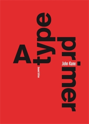
A Type Primer, 2nd edition
Laurence King Publishing (Verlag)
978-1-85669-644-9 (ISBN)
John Kane teaches typography and graphic design at Northeastern University and at Rhode Island School of Design. He has been a practising graphic designer and teacher for the past thirty years.
Acknowledgements Introduction Basics Describing letterforms / The font / Describing typefaces / Measuring type / Comparing typefaces / Display typefaces Development A timeline / Text typeface classification Letters, words, sentences Understanding letterformsd / Maintaining x-height / Form/counterform / Contrast / Reinforcing meaning / Making sentences, finding sense / Type and color / English is not Chinese Text Tracking: kerning and letterspacing / Formatting text / Texture / Typing is not typesetting / Leading and line length / Kinds of proportion / Components of the text page / Placing text on a page / Front matter, back matter / Indicating paragraphs / Highlighting text / Headlines within text / Widows and orphans Columnar organization Columnar layouts / Cross-alignment / Expressing hierarchy / Tabular matter / Type as image and information Grid systems Introduction / An example / Components of the grid / A simple grid / Grids at large scale / Creating a grid for text / Creating a grid for text and images Next Selected bibliography Index Changes to previous edition include: * (in chapter 'Words and Phrases') An expanded section on setting text, including placement of type; choosing an appropriate typeface; how to express the meaning of a text through typography; creating tone on the page through typography; the use of colour to reinforce typographic hierarchy and create depth. * (in chapter 'Text') New material covering type and layout: an explanation of the components of the page (margins, folios, running heads etc.); how to place text on the page (chapter opener design, placement of running heads). * (in chapter 'Grid Systems') More information on type and the grid: expansion of Component of the Grids section with diagrams revised and made bigger; use of the grid as a system for expressing hierarchy in text.
| Erscheint lt. Verlag | 1.5.2011 |
|---|---|
| Verlagsort | London |
| Sprache | englisch |
| Maße | 176 x 250 mm |
| Gewicht | 10 g |
| Themenwelt | Kunst / Musik / Theater ► Design / Innenarchitektur / Mode |
| Informatik ► Grafik / Design ► Desktop Publishing / Typographie | |
| Schlagworte | Typographie; Hand-/Lehrbuch |
| ISBN-10 | 1-85669-644-8 / 1856696448 |
| ISBN-13 | 978-1-85669-644-9 / 9781856696449 |
| Zustand | Neuware |
| Haben Sie eine Frage zum Produkt? |
aus dem Bereich


