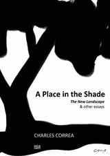
Charles Correa (eBook)
256 Seiten
Hatje Cantz Verlag
978-3-7757-3402-8 (ISBN)
Cover
Imprint
Title
A Place In The Shade
The Assembly at Chandigarh
He flies through the air with the greatest of ease
That daring old man on the flying trapeze.
—Ancient Occidental folk song
I
One arrives at Chandigarh. One travels through the town, past the houses spread out in the dust like endless rows of confidence tricks; and down the surrealistic roads—V.1’s and V.2’s—running between brick walls to infinity. Chandigarh, brave new Chandigarh, born in the harsh plains of the Punjab without an umbilical cord.
Then in the distance, like an aircraft carrier floating above the flotsam and jetsam of some harbour town, appears the Secretariat. From miles away one sees it, white in the sunlight, racing along with the car, riding high above the rows of gimcrack houses that make up the foreground. Gradually this proscenium clears, and the other two elements of the Capitol appear: the Assembly and the High Court; and the three buildings ride together against the grey-blue foothills of the Himalayas. Ride together, swinging sometimes in front of each other and sometimes behind enormous banks of earth. One approaches closer and closer to the complex, and the bleached whiteness deepens slowly into the grey-green of concrete, the simple outlines of the masses dissolve into an astonishing, voluptuous complexity of shadow and substance.
Incredible, evocative architecture! ‘Stones are dead things sleeping in quarries, but the apses of St. Peter are a passion!’ Throughout his life, Corbusier has sought to create an architecture of passion. His buildings—both in concept and visual language—have always been presented at a certain decibel level. No sotto voce, no politeness, but—like Wagner—thunder in the concert hall. This is probably the singlemost important fact about Corb because it necessitates his discarding any solutions which cannot be projected at the decibel level he favours.
How does one project architecture at this decibel level? As an intelligent architect, Corb immediately perceived the necessity for a strong concept (‘the plan is the generator’); but concept alone is not enough, and as an artist he became more and more aware of the importance of developing an impassioned visual language that would project these concepts. Thus, each of Corb’s buildings was a consecutive step in his search to develop the power—and further the boundaries—of his vocabulary and syntax. Other architects from Brazil to Tokyo have created buildings which can be termed ‘applied Corb’; Corb himself has never applied what is safe and proven. He has always sought to demonstrate something we did not know.
In 1922, Cocteau wrote: ‘Genius, in art, consists in knowing how far we may go too far. Don’t touch it any more, cries the amateur. It is then that the true artist takes his chance.’
And Corb himself has written in his poem, ‘Acrobat’:
An acrobat is no puppet.
He devotes his life to activities
in which, in perpetual danger of death,
he performs extraordinary movements
of infinite difficulty, with disciplined
exactitude and precision . . . free
to break his neck and his bones and
be crushed.
Nobody asked him to do this.
Nobody owes him any thanks.
He lives in an extraordinary
world, of the acrobat
Result: most certainly! He does things
which others cannot.
Result: why does he do them?
others ask. He is showing off;
he’s a freak; he scares us, we pity him;
he’s a bore.
Concept and language—in his work up to the Unite d’Habitation at Marseilles, Corb gave weight to both these aspects of architecture. (In fact, the Unite is an astonishing complex of spatial, structural, economic and perhaps sociological relevance.) Since then—and especially in his buildings in India—Corb has become more and more absorbed in his visual language; and however masterful this language may have become, it is still only one aspect of any great architecture. So we have the High Court in Chandigarh: a building where large areas were ill-planned and badly lit, but with a spellbinding entrance where a whole new aesthetic world came into being; and the Secretariat: a structure with a magnificent façade, like a stage set. Did not the earlier Corb promise something less skin-deep, something more conceptual?
The third building in the complex, the new Assembly, is in this sense a return to the earlier Corb, for in this Assembly he has produced an architecture that is not restricted to an entrance, nor to a façade, but to the functions of the programme and to the very spaces within the building itself.
II
The idea behind the Assembly is extremely simple: along three sides of the building, 300 ft square, are located offices and conference rooms; the fourth side is an enormous portico which ‘orients’ the building towards the High Court. In the centre is an interior court, 200 ft across, ranging from 35 ft to 45 ft high, wherin are located the hyperbolic form of the Assembly chamber, the rectangle (surmounted by a skewed pyramidal roof) of the Council chamber and the extraordinary collection of spaces, ramps and platform levels that make up the forum. (Corb has provided the principal users of the building—the legislators, the office workers, the press and the visiting public—each with their own system of entrances, lobbies, stairs, etc., thus ensuring their separation.)
The drama of the building starts with its skyline. Corb always placed the greatest emphasis on the total volume of a building and its silhouette against the sky (as, for instance, the ramp on the roof of the Secretariat which acts like an immense spine holding the marvellously long, fractured, ungainly façade together. Eliminate the ramp and the façade disintegrates into several different buildings.) So also the Assembly; the three elements on the roof—the hyperboloid, the pyramid and the lift-tower—play out a dance-drama against the sky. The hyperboloid is inexpressibly beautiful from a distance—white in the sunlight, yet soft as snow. The three elements pirouette around each other as we approach the building, exchanging positions and crossing back and forth. Finally they recede behind the enormous sweep of the portico.
The other three façades (which form the base of this ‘stage’) are simple; necessarily so, for they must also provide counterpoint to the façade of the Secretariat next door. And so it is the gargantuan portico which gives the building direction, turning it to face the High Court. One enters under the 50 ft high canopy and through the pivoting door (25 sqft!) and the drama of the interior spaces commences. (Corb certainly knows how to provide an entrance; one thinks of the Mill-Owners’ building in Ahmedabad with its ramp reaching out like a long hand to pick passers-by off the road.)
How can one begin to convey a sense of so complex an interior? Study the sections and plans. Even a cursory glance will illustrate how very cunning and sensitive is Corb’s handling of spaces; e.g., his continuous use of the L-shape (the leg of which forms an escape-valve to what would otherwise be a static square). In other words, Corb, like Frank Lloyd Wright, is keenly aware of the distances that can be seen from any given point. By never defining the limits of this vision (the sections and plans are coordinated so that the eye can always see beyond and around the corner), the spaces remain dynamic and uncontained. As one traverses the ramps and platform levels of the forum, one builds up a series of images which are superimposed on the brain, creating an overall pattern of incredible richness.
This is a fundamental technique of Corb’s. The complexity of his architecture is not due to the creation of one single intricate pattern but is rather due to the creation of several different patterns which, through superimposition, generate an indescribable complexity. This can be illustrated by the river façade of the Mill-Owners’ building in Ahmedabad (four separate patterns playing together like instruments in a band), and by the façade of the Secretariat, where a visual tour-de-force is generated by juxtaposing brise-soleil grilles of various patterns and scales. (This technique has also been used in the marble grilles of Fatehpur Sikri and the shoji screens of Japan.) This is not...
| Erscheint lt. Verlag | 20.6.2012 |
|---|---|
| Reihe/Serie | E-Books | E-Books |
| Verlagsort | Berlin |
| Sprache | englisch |
| Themenwelt | Kunst / Musik / Theater ► Malerei / Plastik |
| Sachbuch/Ratgeber ► Freizeit / Hobby ► Fotografieren / Filmen | |
| Schlagworte | Architektur • ArchitekturStadtplanung • In • Indien • Landschaft: • postkoloniale |
| ISBN-10 | 3-7757-3402-3 / 3775734023 |
| ISBN-13 | 978-3-7757-3402-8 / 9783775734028 |
| Haben Sie eine Frage zum Produkt? |
Größe: 30,8 MB
DRM: Digitales Wasserzeichen
Dieses eBook enthält ein digitales Wasserzeichen und ist damit für Sie personalisiert. Bei einer missbräuchlichen Weitergabe des eBooks an Dritte ist eine Rückverfolgung an die Quelle möglich.
Dateiformat: EPUB (Electronic Publication)
EPUB ist ein offener Standard für eBooks und eignet sich besonders zur Darstellung von Belletristik und Sachbüchern. Der Fließtext wird dynamisch an die Display- und Schriftgröße angepasst. Auch für mobile Lesegeräte ist EPUB daher gut geeignet.
Systemvoraussetzungen:
PC/Mac: Mit einem PC oder Mac können Sie dieses eBook lesen. Sie benötigen dafür die kostenlose Software Adobe Digital Editions.
eReader: Dieses eBook kann mit (fast) allen eBook-Readern gelesen werden. Mit dem amazon-Kindle ist es aber nicht kompatibel.
Smartphone/Tablet: Egal ob Apple oder Android, dieses eBook können Sie lesen. Sie benötigen dafür eine kostenlose App.
Geräteliste und zusätzliche Hinweise
Buying eBooks from abroad
For tax law reasons we can sell eBooks just within Germany and Switzerland. Regrettably we cannot fulfill eBook-orders from other countries.
aus dem Bereich


