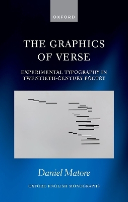
The Graphics of Verse
Experimental Typography in Twentieth-Century Poetry
Seiten
2023
Oxford University Press (Verlag)
978-0-19-285721-7 (ISBN)
Oxford University Press (Verlag)
978-0-19-285721-7 (ISBN)
Exploiting the expressive possibilities of print--from spacing and indentation to alignment and typeface--is one of the defining ways in which poetry was modernized in the twentieth-century. This book explores why British and American poets choose to experiment with the design and lay-out of the printed page.
Is poetry a visual art? Why do the pages of nineteenth-century poetry look so different to those of twentieth-century verse? Exploiting the expressive possibilities of print--from spacing and indentation to alignment and typeface--is one of the defining ways in which poetry was modernized in the twentieth century. While the visual experiments of European poets have been well documented, the typographical explorations of poets writing in English have been largely neglected. This volume confronts a major unanswered question: why did British and American poets, from the beginning of the twentieth century right up to the present day, choose to experiment with the design and lay-out of the printed page?
This book aims to provide the first detailed account of this lineage of literary style, examining the poetry and criticism of figures such as Ezra Pound, Hope Mirrlees, William Carlos Williams, E.E. Cummings, Marianne Moore, David Jones, Denise Levertov, Charles Olson, Frances Motz Boldereff, and J.H. Prynne. It draws on unpublished archival materials to show how poets began to draft, sketch, and compose in new and eccentric ways as they annexed the roles of book designer and printer. Typography, it argues, was instrumental in debates about metre, free verse, and the nature of poetry as poems morphed into scores, slogans, maps, and signs. It investigates how the typography of poetry was animated by musicology, psychophysics, linguistics, politics, ophthalmology, cartography, and advertising.
Daniel Matore is Lecturer in Modern, American and Comparative Literature at the University of York. He read for a BA and MPhil in English at the University of Cambridge, winning the Betha Wolferstan Rylands Prize. He received his DPhil from the University of Oxford and has been awarded grants by the Arts and Humanities Research Council. He has previously been lecteur d'anglais at the École Normale Supérieure de Lyon and Jean Nordell Fellow at the Houghton Library, Harvard University.
Introduction
1: Pound's Transmissions
2: Cummings's Typewriter Language
3: Olson Among The Letterers
Conclusion
Bibliography
| Erscheinungsdatum | 12.12.2023 |
|---|---|
| Reihe/Serie | Oxford English Monographs |
| Zusatzinfo | 13 Illustrations |
| Verlagsort | Oxford |
| Sprache | englisch |
| Maße | 145 x 225 mm |
| Gewicht | 444 g |
| Themenwelt | Geisteswissenschaften ► Sprach- / Literaturwissenschaft ► Anglistik / Amerikanistik |
| Geisteswissenschaften ► Sprach- / Literaturwissenschaft ► Literaturwissenschaft | |
| ISBN-10 | 0-19-285721-5 / 0192857215 |
| ISBN-13 | 978-0-19-285721-7 / 9780192857217 |
| Zustand | Neuware |
| Haben Sie eine Frage zum Produkt? |
Mehr entdecken
aus dem Bereich
aus dem Bereich
Poetik eines sozialen Urteils
Buch | Hardcover (2023)
De Gruyter (Verlag)
59,95 €
Buch | Softcover (2024)
belleville (Verlag)
20,00 €


