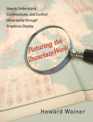
Picturing the Uncertain World
Princeton University Press (Verlag)
978-0-691-15267-7 (ISBN)
In his entertaining and informative book Graphic Discovery, Howard Wainer unlocked the power of graphical display to make complex problems clear. Now he's back with Picturing the Uncertain World, a book that explores how graphs can serve as maps to guide us when the information we have is ambiguous or incomplete. Using a visually diverse sampling of graphical display, from heartrending autobiographical displays of genocide in the Kovno ghetto to the "Pie Chart of Mystery" in a New Yorker cartoon, Wainer illustrates the many ways graphs can be used--and misused--as we try to make sense of an uncertain world. Picturing the Uncertain World takes readers on an extraordinary graphical adventure, revealing how the visual communication of data offers answers to vexing questions yet also highlights the measure of uncertainty in almost everything we do. Are cancer rates higher or lower in rural communities? How can you know how much money to sock away for retirement when you don't know when you'll die? And where exactly did nineteenth-century novelists get their ideas? These are some of the fascinating questions Wainer invites readers to consider.
Along the way he traces the origins and development of graphical display, from William Playfair, who pioneered the use of graphs in the eighteenth century, to instances today where the public has been misled through poorly designed graphs. We live in a world full of uncertainty, yet it is within our grasp to take its measure. Read Picturing the Uncertain World and learn how.
Howard Wainer is distinguished research scientist at the National Board of Medical Examiners and adjunct professor of statistics at the Wharton School of the University of Pennsylvania. His many books include "Graphic Discovery" (Princeton).
Preface and Acknowledgments xv I. Introduction and Overview Chapter 1: The Most Dangerous Equation 5 In this chapter we nominate De Moivre's1 description of the expected variation in the arithmetic mean for the title of the most dangerous equation. To support this conclusion we describe five separate examples where ignorance of this equation has led to enormous wastes of time, money, and human resources. These five examples span almost a thousand years and areas as diverse as monetary policy, education policy, medical practice, and the genetic basis of sex differences in intelligence. II. Political Issues In this section we show how five different kinds of issues that emerged from essentially political arguments could be illuminated with more careful thought and a graph or two. In chapter 6, we introduce a very simple probabilistic model that yields surprising richness of understanding, which apparently escaped the editorial writers of the New York Times. Chapter 2: Curbstoning IQ and the 2000 Presidential Election 23 Sometimes, when facts are hard to come by, people who are tasked to gather those facts simply substitute a guess. When this is done by census workers it is called "curbstoning" (as in sitting down on the curbstone in front of a house and guessing how many people live there). Curbstone estimates, although illegal and grounds for dismissal, have shown themselves to be remarkably accurate. In this chapter we look at a piece of political propaganda meant to highlight the intellectual and financial differences between red and blue states. Although it was clearly based on someone's biases and not actual data, the conclusions we would draw from the faked data are close to actual results. Chapter 3: Stumbling on the Path toward the Visual Communication of Complexity 31 An op-ed piece in the New York Times written by former secretary of state George Schultz contained a statistical graph that showed the economic superiority of the two Bush administrations to the Clinton administration that was sandwiched in between. We show how this graphic distorts our perceptions by plotting rates of change instead of the actual GDP. The result is exactly the opposite of what former Secretary Schultz argues. Chapter 4: Using Graphs to Simplify the Complex: Th e Medicare Drug Plan as an Example 35 The Medicare drug plan, although passed with great fanfare, quickly resolved itself into a complex puzzle. In this chapter we simplify one part of the puzzle by drawing a graph that makes clear who should sign up. The graph is not a full solution, for how the costs will be paid remains shrouded in a deep mystery indeed. Chapter 5: A Political Statistic 39 Neither graphs nor tables are guarantees of truth. Incorrect stories can be concocted with data displays just as they can with words. In this chapter we investigate a graph produced by the U.S. Department of Education that vividly shows how fourth graders' reading scores remain stubbornly flat despite skyrocketing increases in federal expenditures for education. A more careful look indicates that there is a strong positive relationship between students' test scores and money spent on education. Chapter 6: A Catch -22 in Assigning Primary Delegates 47 As the 2008 election loomed ever closer, states maneuvered in various ways to try to gain increased influence. The New York Times argued that New York's citizens were not fully enfranchised because of the all-or-none delegate assignment rule used in the primaries. Using a simple mathematical model, we show that exactly the opposite is true. III. Educational Testing In the four thousand years since its inception in ancient China, mental testing has promised to provide an important tool toward a true meritocratic society. Replacing family connections with an individual's ability as the key to opening the doors to economic and social success remains a principal goal of modern societies. Progress toward this goal has been impressive, but it has occurred in fits and starts. In this section we examine three proposals to aid in using test scores toward making this a more just society. The first uses a statistical method commonly employed in other circumstances to solve a vexing problem. In chapter 8 we examine a well-meaning but, at its heart, flawed scheme aimed at reducing intergroup differences. And finally, in chapter 9, we look at a recent court case involving test scoring and show that the defense's case was based on a misunderstanding of the meaning of uncertainty. Chapter 7: Testing the Disabled: Using Statistics to Navigate between the Sc ylla of Standards and the Charybdis of Court Decisions 55 Test companies are in a logical bind. Standards of testing require that individual scores on tests given under nonstandard conditions (for instance, with extra time) be so labeled, while courts mandate that examinees with disabilities (who are often given accommodations like extra time) not be identified. In this chapter we show a statistical method that can provide a way to be responsive to these two seemingly contradictory requirements. Chapter 8: Ethnic Bias or Statistical Artifact? Freedle's Folly 63 Social scientist Roy Freedle startled the testing world in 2003 when he showed that black examinees outperformed matched white examinees on hard SAT items. He suggested that ethnic group differences in test performance could be reduced dramatically and tests thus made fairer by making the tests harder. In this chapter we look into the validity of this remarkable conclusion. Chapter 9: Insignificant Is Not Zero: Musing on the College Board's Understanding of Uncertainty 74 On October 8, 2005, NCS Pearson, Inc., under contract to the College Entrance Examination Board, scored an administration of the SAT Reasoning test. Subsequently it was discovered that there was a scoring error that had affected 5,024 examinees' scores. After rescoring it was revealed that 4,411 test scores were too low and 613 were too high. The exams that were underscored were revised upward and the revised scores were reported to the designated colleges and universities. The College Board decided that "it would be unfair to re-report the scores of the 613 test takers" whose scores were improperly too high and hence did not correct them. They reached this conclusion because of a misunderstanding of statistical error. In this chapter we discuss their argument and its flaws. IV. Mostly Methodological This section is a bit more technical than the others, focusing more explicitly on the statistical tool, with its application being secondary. In chapter 10 we look at the validity of linear extrapolation through unexpectedly consistent improvements in the world record for men running a mile that have occurred over the course of the twentieth century and speculate whether it should have been predictable, and what, if anything, it means about future improvements in the twenty-first century. The eleventh chapter looks at statistical graphics in the popular media. Chapter 12 demonstrates how a mixture of statistical tools, statistical thinking, and various graphic forms combine to provide us with a guided pathway of discovery. The last two chapters are perhaps the most narrowly focused of all, looking first at ways to show our uncertainty graphically and next at one way in which powerful computing when combined with our desire for simplicity at all costs can be used to mislead us. Chapter 10: How Long Is Short? 87 All functions are well approximated by a straight line for a short part of their length. But how can we know for how long the linear approximation is suitable? Obviously, when the entire data series is in hand it is easy, but what about when it is not? What do we do when we wish to extrapolate from what appears to be linear beyond the data? For a very short extrapolation it is usually fine, but how long is short? In this chapter we look at a century's progress in the world records in the mile run for help in answering this question. Chapter 11: Improving Data Displays 92 The communication media's stock and trade is the distillation and communication of possibly complex information. To do this effectively the print media use an especially broad range of graphical formats. Sometimes they do this poorly, but sometimes they do it very well indeed. In this chapter we look at some displays devised by the media that set a standard for excellence hard to imagine given their time deadlines, as well as others that were seriously flawed. Chapter 12: Old Mother Hubbard and the United Nations 106 Statistical thinking and data-based graphics are two tools used together to understand the world. This chapter tells a story of how a detective might use them to track down and expose some surprising aspects of poverty. Chapter 13: Depicting Error 121 Communicating data without some measure of their precision can lead to misinterpretation and incorrect inferences. In this chapter, we describe and illustrate several conventions for displaying errors along with the data they modify. We also offer some alternatives that seem to provide improvements in the effective communication of error as well as increasing the ease, and hence the likelihood, of their use. These alternatives are illustrated principally with data from the National Assessment of Educational Progress. Chapter 14: The Mendel Effect 148 Data are often examined after being grouped into categories. For example, we might see a plot of income shown as a function of education level, in which amount of education is collapsed (binned) into specified categories like 0-8 years, 9-11, 12, 13-15, 16 or more. A typical summary plot shows the mean value of income as a function of the binned education variable, and trends are interpreted. In this chapter, I demonstrate how such trends can be epiphenomenal and are the creation of the number of bins used and their boundaries. I provide an algorithm that can take trendless data and create trends in any direction. V. History We understand best those things we see grow from their very beginnings. --Aristotle, Metaphysics The Science of Uncertainty has been under development for a long time. In this section, I pay homage to our forebears by using modern tools to investigate ancient puzzles (chapters 15 and 16), by exploring the origins of some of these modern tools (chapters 17 and 19), by defending the wisdom of the ancients from contemporary misuses (chapter 18), by communicating the wisdom of a modern master (chapter 20), and finally by a heart-rending use of graphics to paint an evocative picture of one part of what was perhaps the greatest horror in all human history. Chapter 15: Truth Is Slower than Fiction 161 Novelists often use the latest scientific findings as essential plot elements in their stories. In this chapter, we follow how some of the findings of the nineteenth-century British polymath Francis Galton were used by Arthur Conan Doyle, by Mark Twain, and by Jules Verne, and speculate on who got there first and why. Chapter 16: Galton's Normal 168 Francis Galton was an early adopter of the normal distribution as a means of making inferences about the frequency of occurrence of various human characteristics. In his 1869 book Hereditary Genius, he explains how to do this with a hypothetical graph showing the heights of British men. But the graph Galton made up revealed a serious misunderstanding he had about the normal distribution. In this chapter, we uncover the error and suggest its source. Chapter 17: Nobody's Perfect 173 In 1786, the remarkable Scot William Playfair published a small book in which he invented three of the four basic graphical formats (bar charts, line charts, and pie charts). He did not invent the scatter plot. In this chapter we ask and try to answer the obvious question, "why not?" Chapter 18: When Form Violates Fu nction 179 The title of "finest statistical graphic ever prepared" is generally awarded to the nineteenth-century Frenchman Charles Joseph Minard's remarkable six-dimensional plot showing the fate of the French army as it trekked between the Niemen River on the Poland-Russia border to Moscow and back during Napoleon's ill-fated 1812-1813 campaign. In this chapter, we examine one failing attempt to usurp Minard's famous format for another purpose. Chapter 19: A Graphical Legacy of Charles Joseph Minard: Tw o Jewels from Th e Past 186 Not all of those who sought to emulate Minard's success with data of their own failed. In this chapter, we show how followers of Minard produced treasures of their own by following in the footsteps of the master. Chapter 20: La Diffusion de Qu elques Idees: A Master's Voice 193 Jacques Bertin (1918-) is a French semiologist, trained in Paris, whose seminal work La Semiologie Graphique (1969) laid the groundwork for modern research in graphics. Almost forty years after its publication it still provides important lessons to all those interested in the effective display of quantitative information. In 2002 he sent me a note detailing his most recent developments and asked that I continue to help him in "la diffusion de quelques idees." This chapter tries to do exactly that. Chapter 21: Numbers and the Remembrance of Things Past 199 A single death is a tragedy; a million deaths is a statistic. --Joseph Stalin (1879-1953) Unquestionably cold and cruel, this epigram conveys a sentiment that sadly captures an aspect of human psychology. The mind is limited in its capacity to fathom cataclysmic events. Great numbers of deaths, particularly if they are distant in time or space, typically do not elicit the same reaction as fewer deaths nearer to us. Sponsors and designers of memorials face the challenge of stirring emotion, memory, and understanding. In this final chapter we show and discuss data displays produced by the inhabitants of the Kovno Ghetto to record their own deaths--so that they might transform what could have been only a statistic into the tragedy that it undeniably was. VI. Epilogue Notes 211 References 215 Source Material 225 Index 229
| Erscheint lt. Verlag | 30.10.2011 |
|---|---|
| Zusatzinfo | 11 color illus. 14 halftones. 81 line illus. 12 tables. |
| Verlagsort | New Jersey |
| Sprache | englisch |
| Maße | 178 x 229 mm |
| Gewicht | 454 g |
| Themenwelt | Sachbuch/Ratgeber ► Natur / Technik |
| Mathematik / Informatik ► Mathematik ► Allgemeines / Lexika | |
| Mathematik / Informatik ► Mathematik ► Mathematische Spiele und Unterhaltung | |
| Wirtschaft ► Betriebswirtschaft / Management ► Allgemeines / Lexika | |
| ISBN-10 | 0-691-15267-5 / 0691152675 |
| ISBN-13 | 978-0-691-15267-7 / 9780691152677 |
| Zustand | Neuware |
| Haben Sie eine Frage zum Produkt? |
aus dem Bereich


