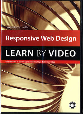
Responsive Web Design
Peachpit Press Publications (Hersteller)
978-0-321-97114-2 (ISBN)
- Titel ist leider vergriffen;
keine Neuauflage - Artikel merken
This video course starts by explaining the three primary components of responsive design: fluid layouts, media queries and responsive images. With a firm understanding of those in place, we branch out and explore how responsive design impacts workflow, how to maintain the hierarchy of content, how to use feature detection to enhance the experience, how to organize your JavaScript to play along nicely, how to optimize responsive sites for performance—and more.
Course objectives & goals: This course arms its students with the skills necessary to start building quality responsive sites today. By the end of the course, students will know how to:
Use fluid layouts, media queries and fluid images to create responsive layouts
Use responsive image techniques to serve appropriately sized images to a variety of devices
Ensure that the hierarchy of content is preserved across screen sizes
Enhance the functionality of your site with feature detection
Improve the performance of your site and avoid becoming another example of "fat" responsive design
Adjust your existing workflow to better accomodate multi-device design and development
Determine what devices to test on and how
Course Requirements: To get the most out of this course, you'll need your favorite code editor and ideally a couple of devices to test on. If you don't have a tablet and phone for testing, then you'll want to get ahold of a simulator or use one of the many device testing services online to follow along. You could, theoretically, follow along by resizing your browser, but I highly recommend against it—you'll get much more out of it by seeing how things behave on different devices.
User Level: Beginning/Intermediate
System Requirements
Mac OS X 10.6, Microsoft Windows XP, or higher
GHz processor or higher
2 GB RAM or higher
1 GB Free HD Space (does not include lesson files)
Please note that this DVD can be viewed only on a computer. It will not work in DVD-Video player software or a DVD set-top player.
Tim Kadlec is a web developer living in northern Wisconsin. His diverse background working with small companies, large publishers, and industrial corporations has allowed him to implement the careful application of web technologies can impact businesses of all sizes. He organizes the Breaking Development Conference, one of the first conferences dedicated to design and development for mobile devices using web technologies. He is the author of Implementing Responsive Design. He also writes about a variety of topics at timkadlec.com.
TOPIC
RESPONSIVE WEB DESIGN
What is Responsive Web Design
History of mobile web design
WHY IMPLEMENT RESPONSIVE WEB DESIGN
Business benefits
User benefits
FLUID LAYOUTS
Fluid Layouts
Fluid Layout example
MEDIA QUERIES
Media Queries
Media Query example
RESPONSIVE MEDIA
Responsive Media
Responsive Media example
PLANNING
Planning
Planning scenarios
DESIGN WORKFLOW
Design Workflow
Design Workflow examples
CONTENT HIERARCHY
Content Hierarchy
Content Hierarchy examples
RESS (improve performance)
RESS (improve performance)
RESS examples
EXPERIENCES
Experiences
Experience examples
QUALITY ASSURANCE
Testing across the continuum
|SUMMARY|
| Erscheint lt. Verlag | 18.9.2014 |
|---|---|
| Verlagsort | Berkeley |
| Sprache | englisch |
| Maße | 138 x 191 mm |
| Gewicht | 74 g |
| Themenwelt | Mathematik / Informatik ► Informatik ► Netzwerke |
| Informatik ► Web / Internet ► Web Design / Usability | |
| ISBN-10 | 0-321-97114-0 / 0321971140 |
| ISBN-13 | 978-0-321-97114-2 / 9780321971142 |
| Zustand | Neuware |
| Haben Sie eine Frage zum Produkt? |